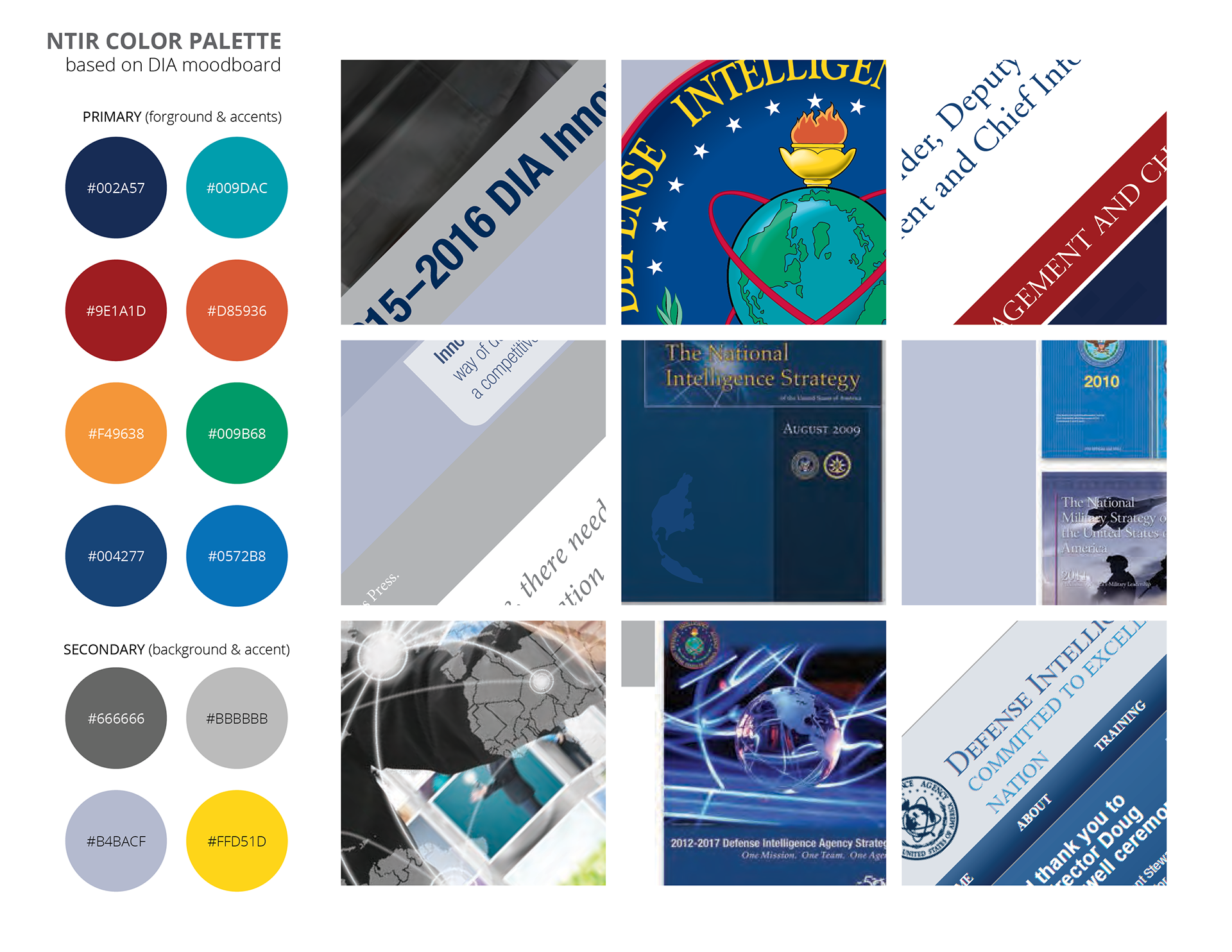
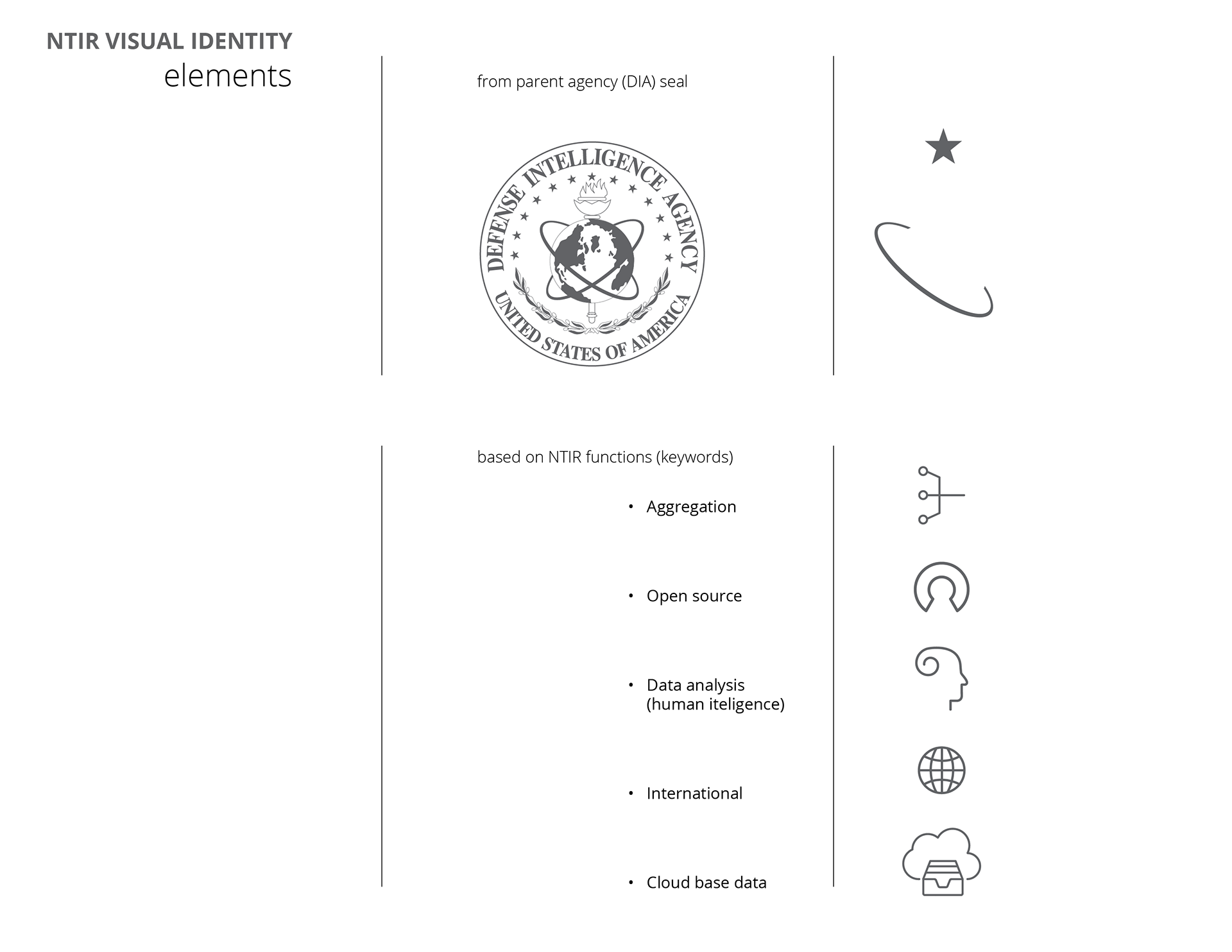
It was important to keep the visual brand of the app within the parent agency's look and feel. The colors on the left were generated from the existing publications cropped to create a mood board. These colors were now potential candidates for the app's color palette and logo yet to be designed. But I had no intention of using all these colors. The next step was creating vector elements for the logo, some borrowed from the seal of the agency and some fresh symbols describing the app's function (see below).

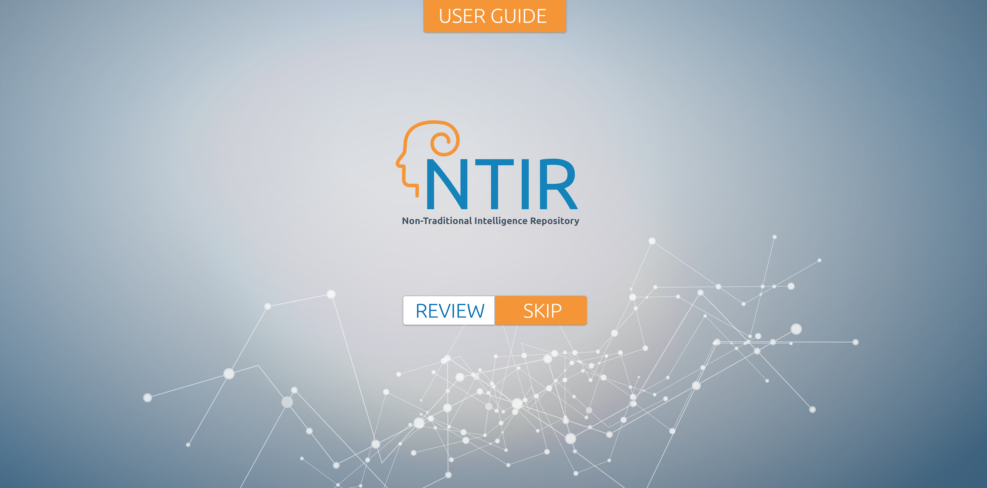
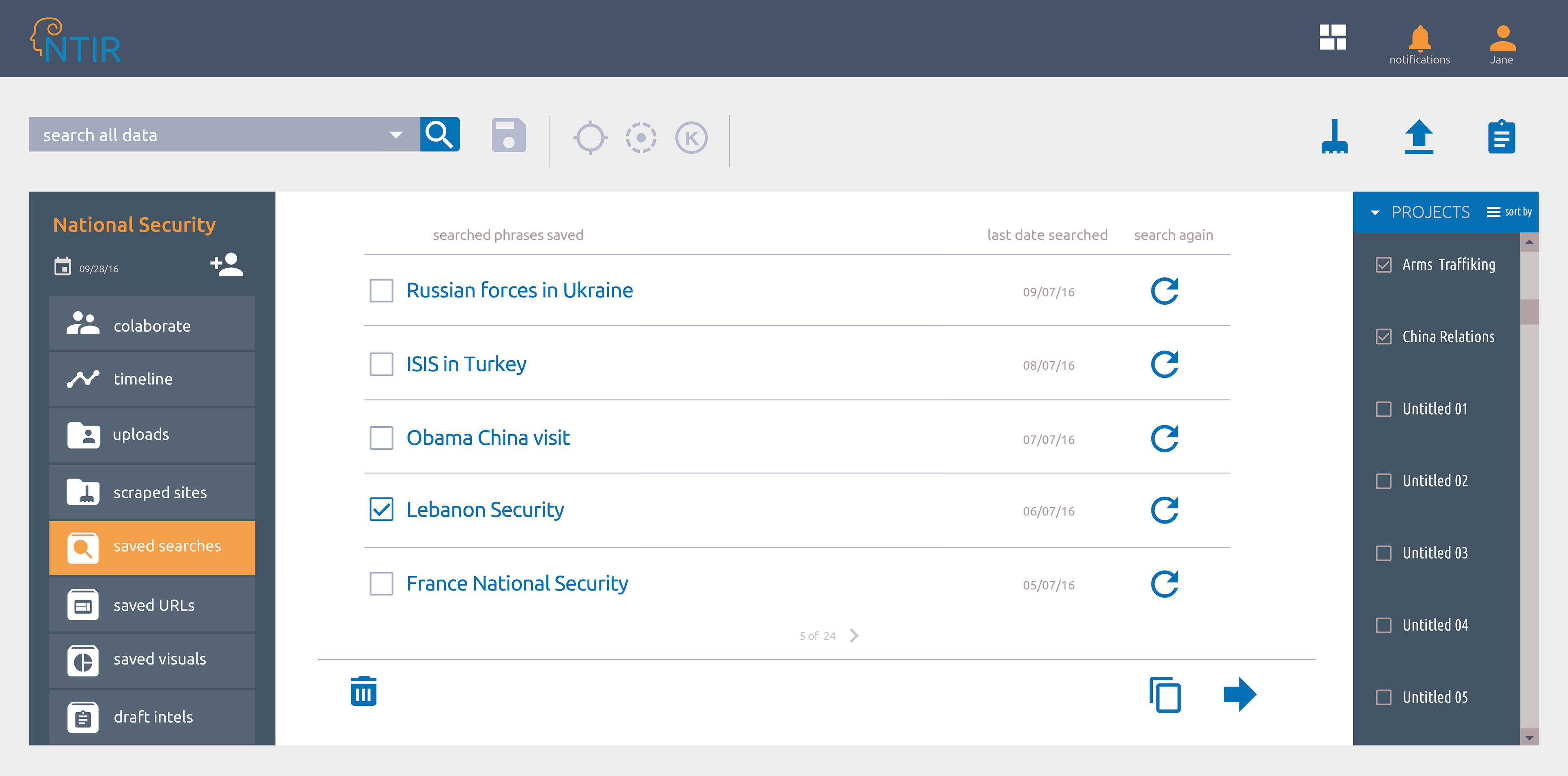
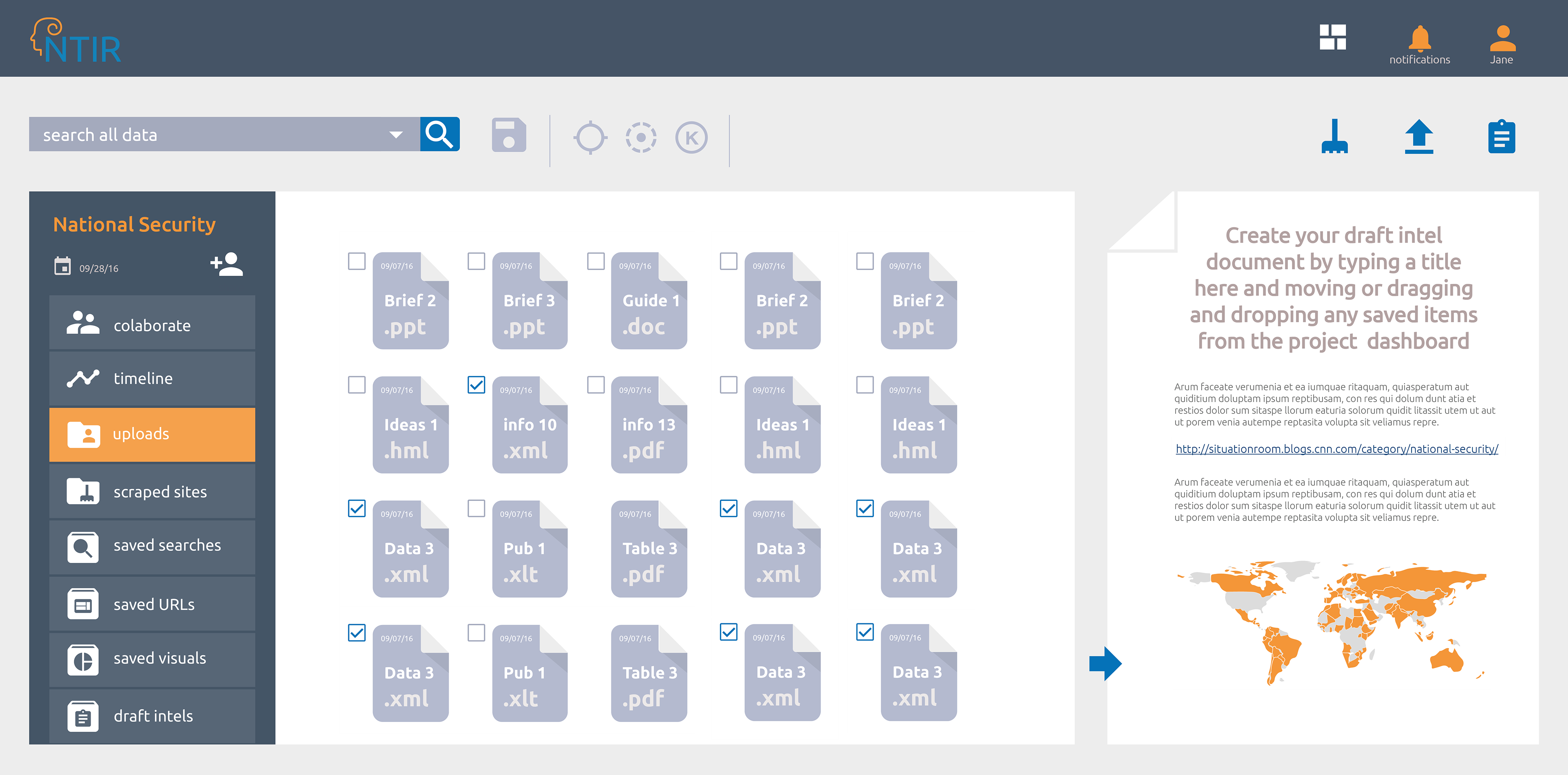
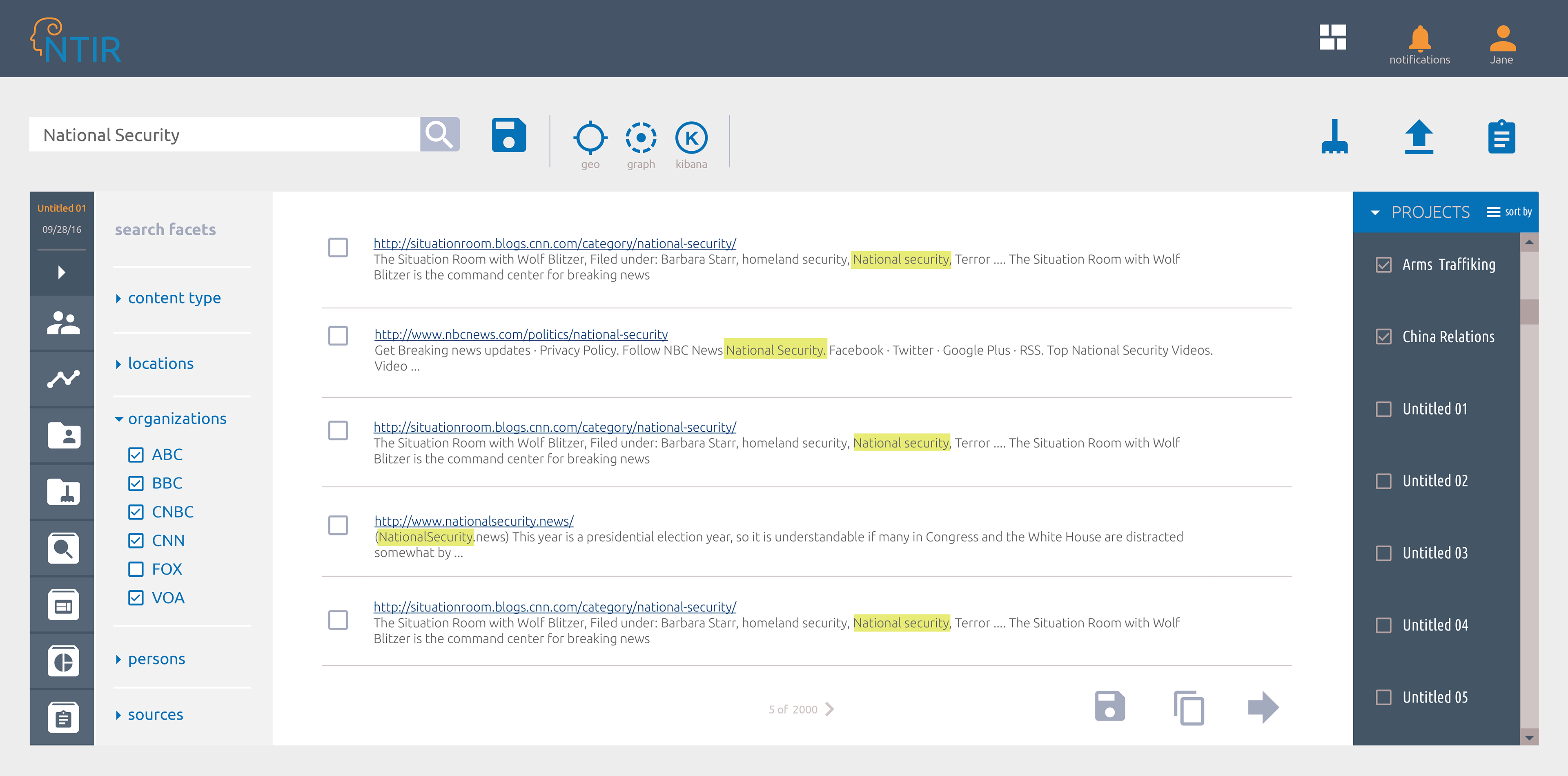
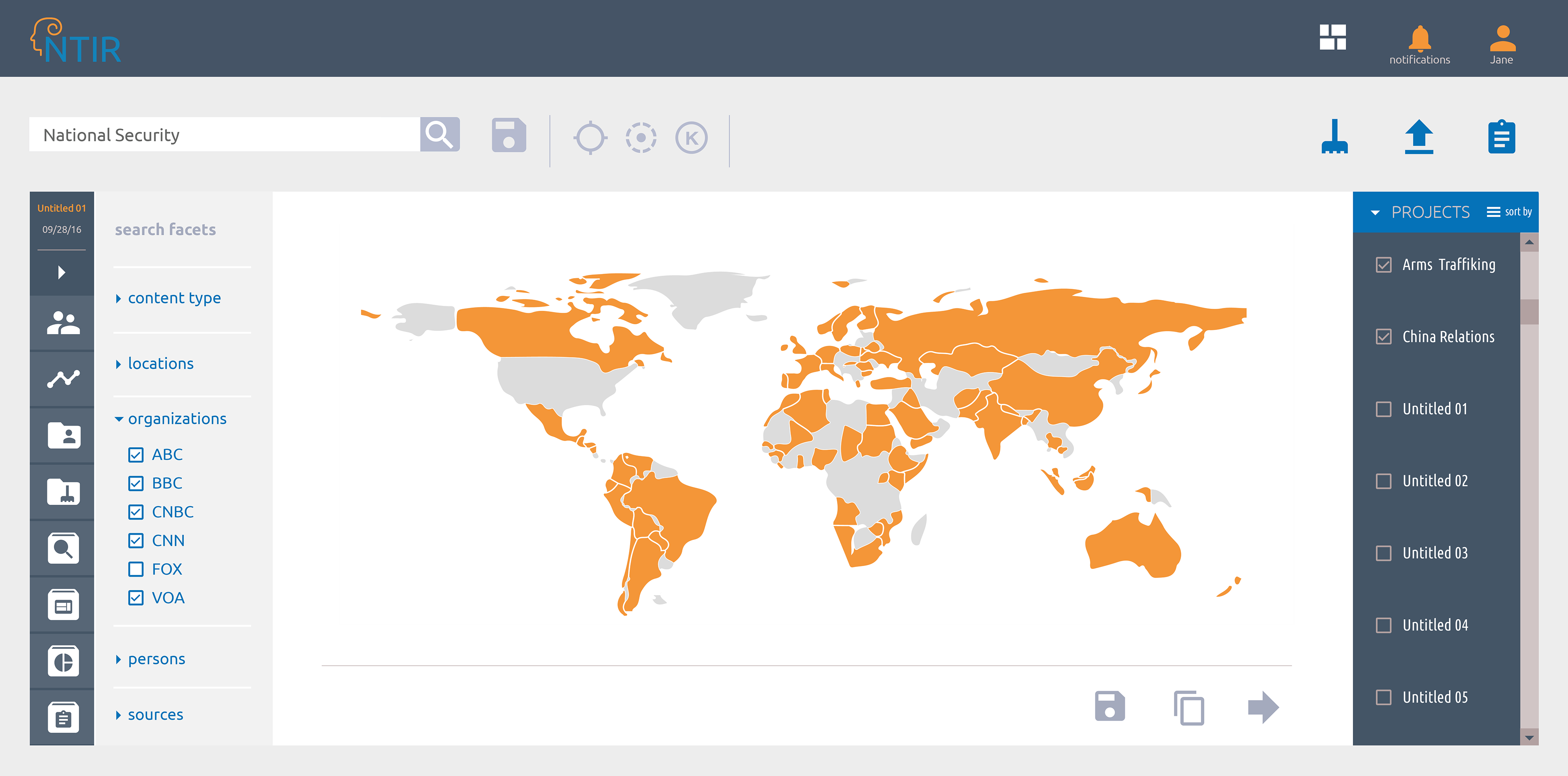
Non-Traditional Intelligence Repository (NTIR)
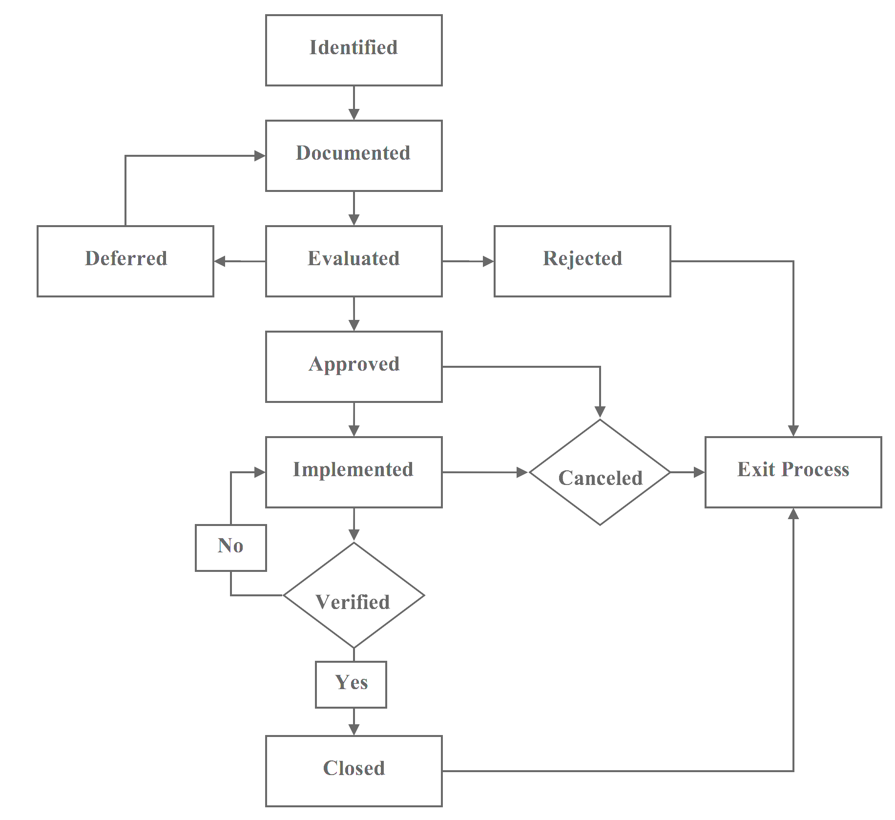
Backend Task Flow
Backend Task Flow
Beta version prior to UX/UI design