
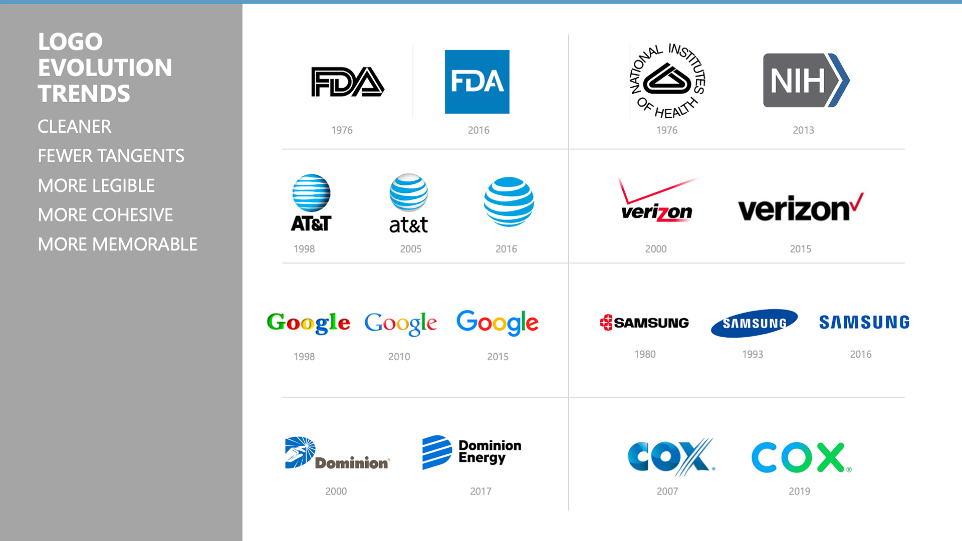
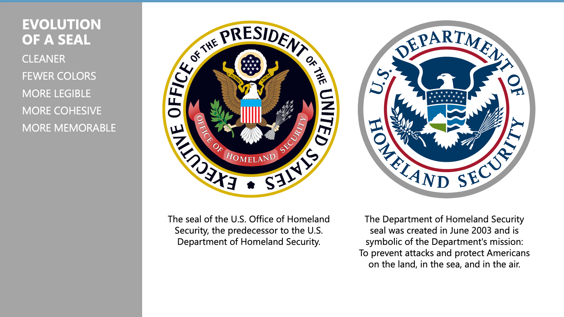
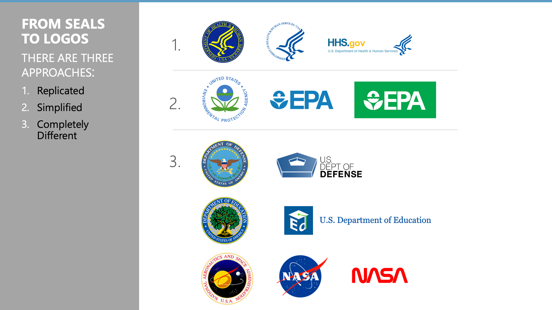
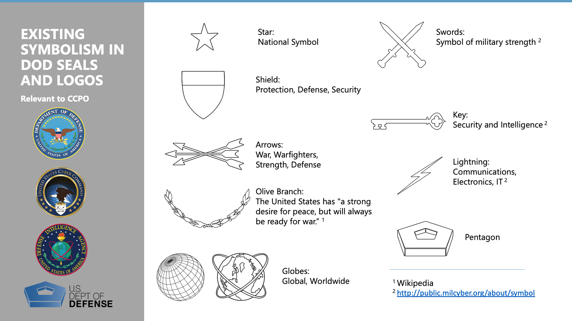
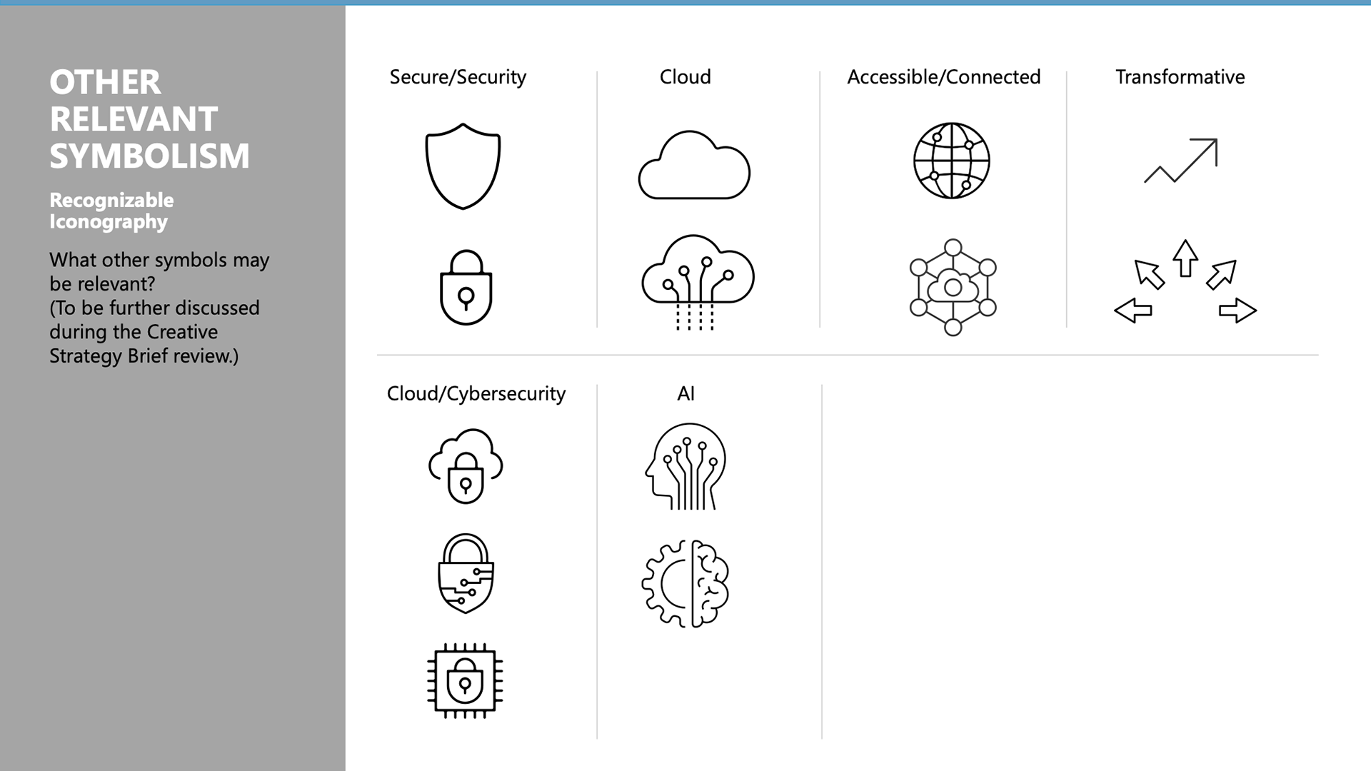
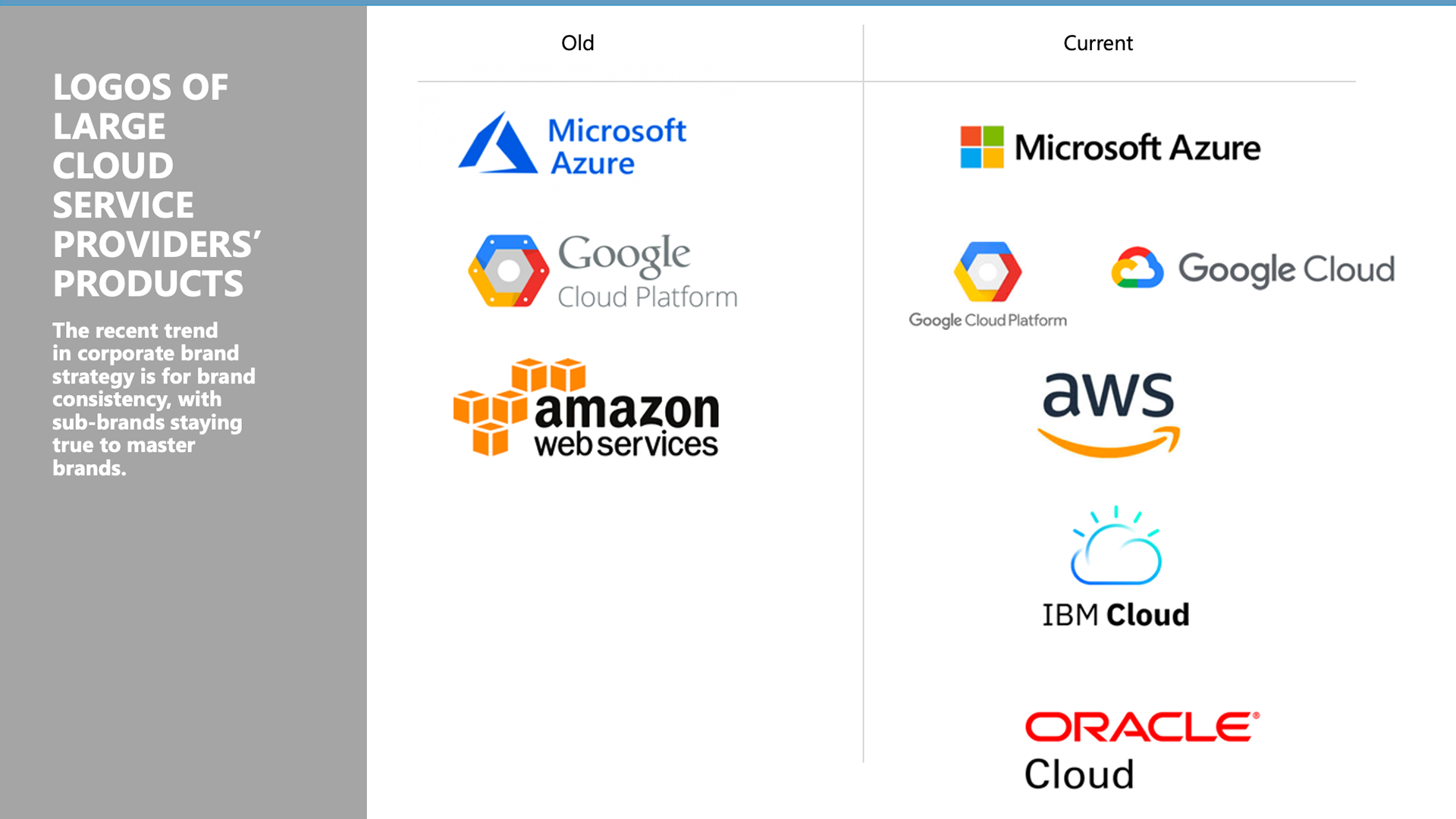
I started with conducting a branding workshop for brainstorming the creative strategy together with the Pentagon team, including general logo trends, review of other government seals and logos, the symbolism in the existing U.S. seals, other relevant pictograms, and a review of the large corporate cloud service providers' brands. Below are main parts of the presentation I created for the workshop. It demonstrates the importance of relevant research in brand identity design:
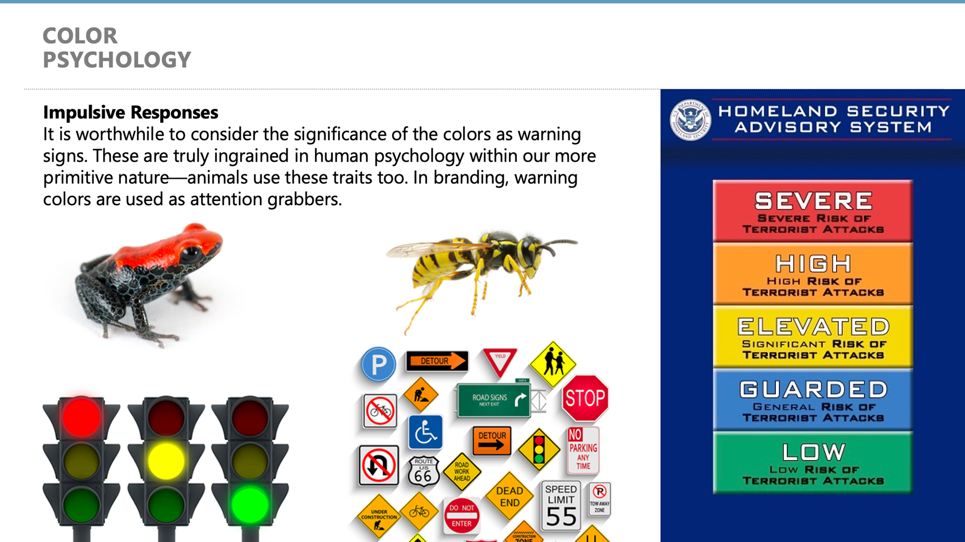
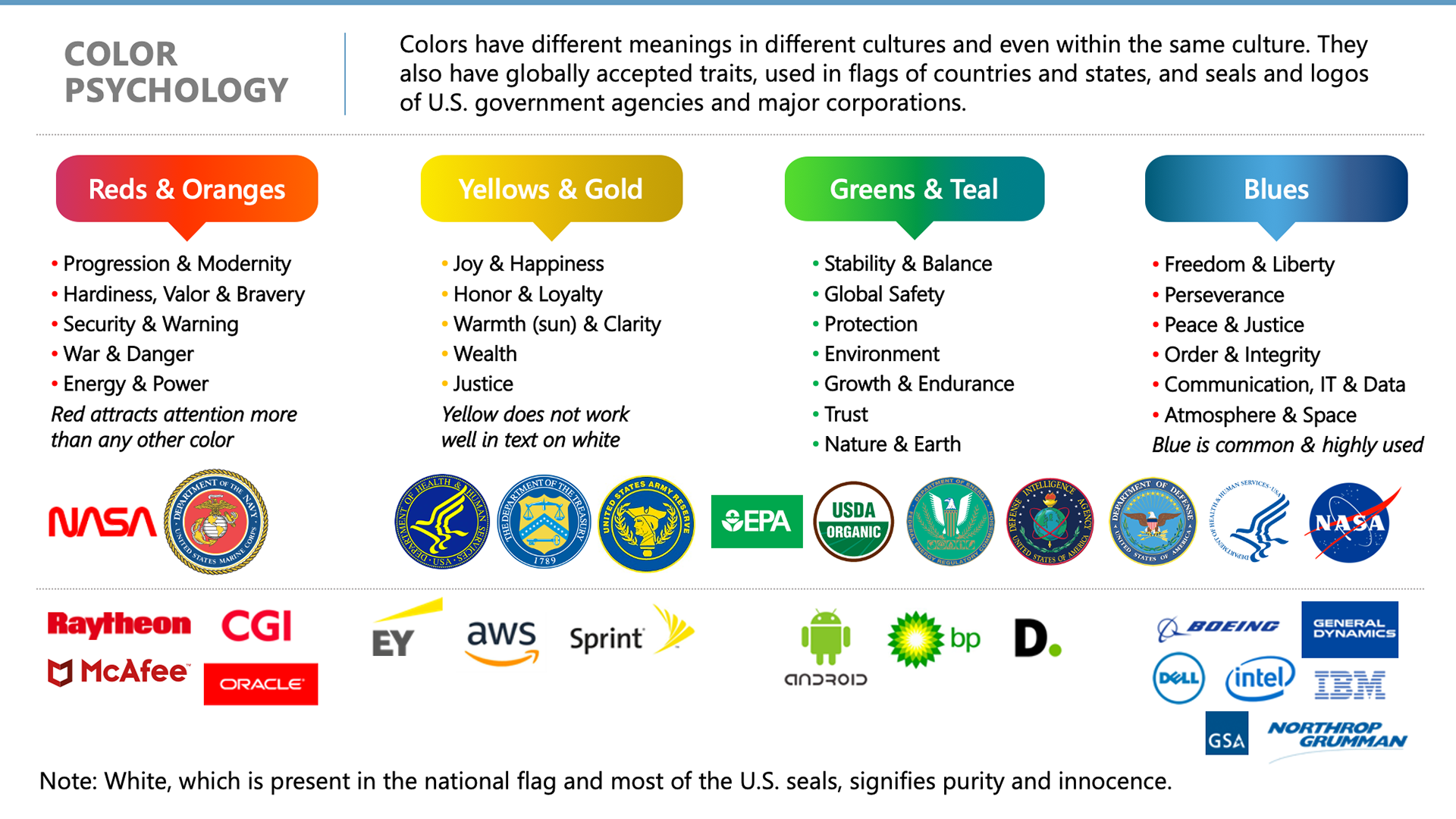
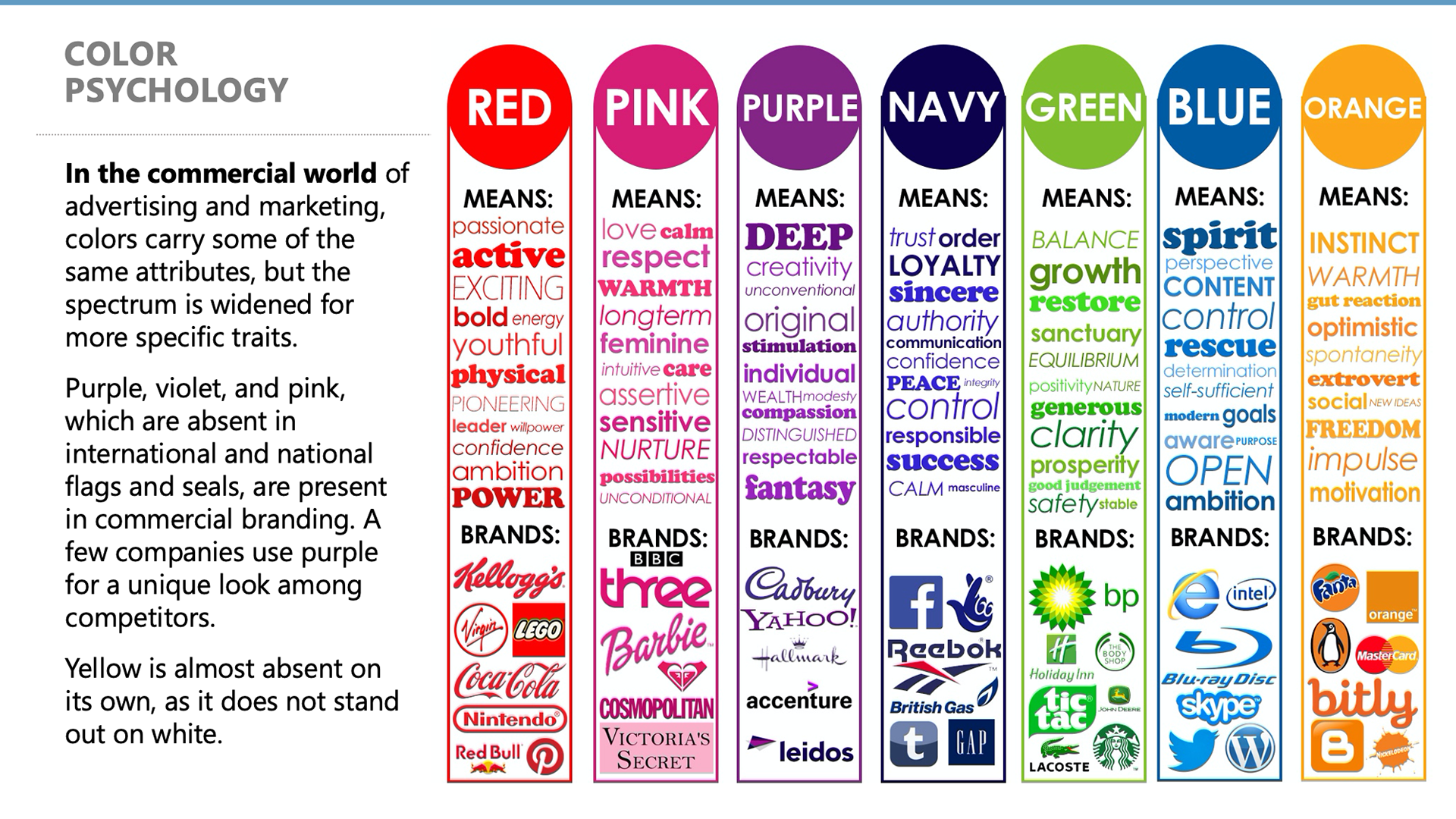
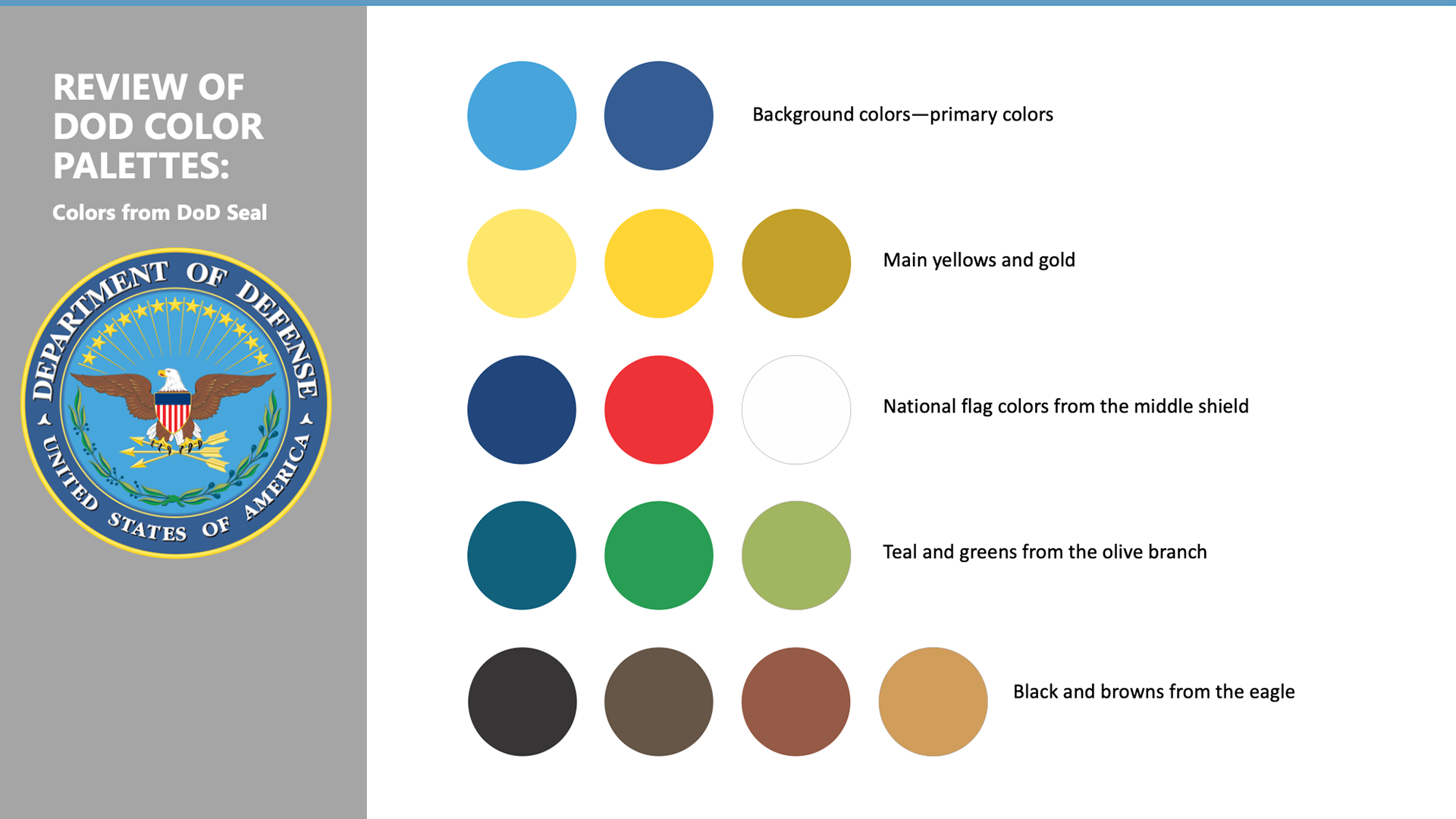
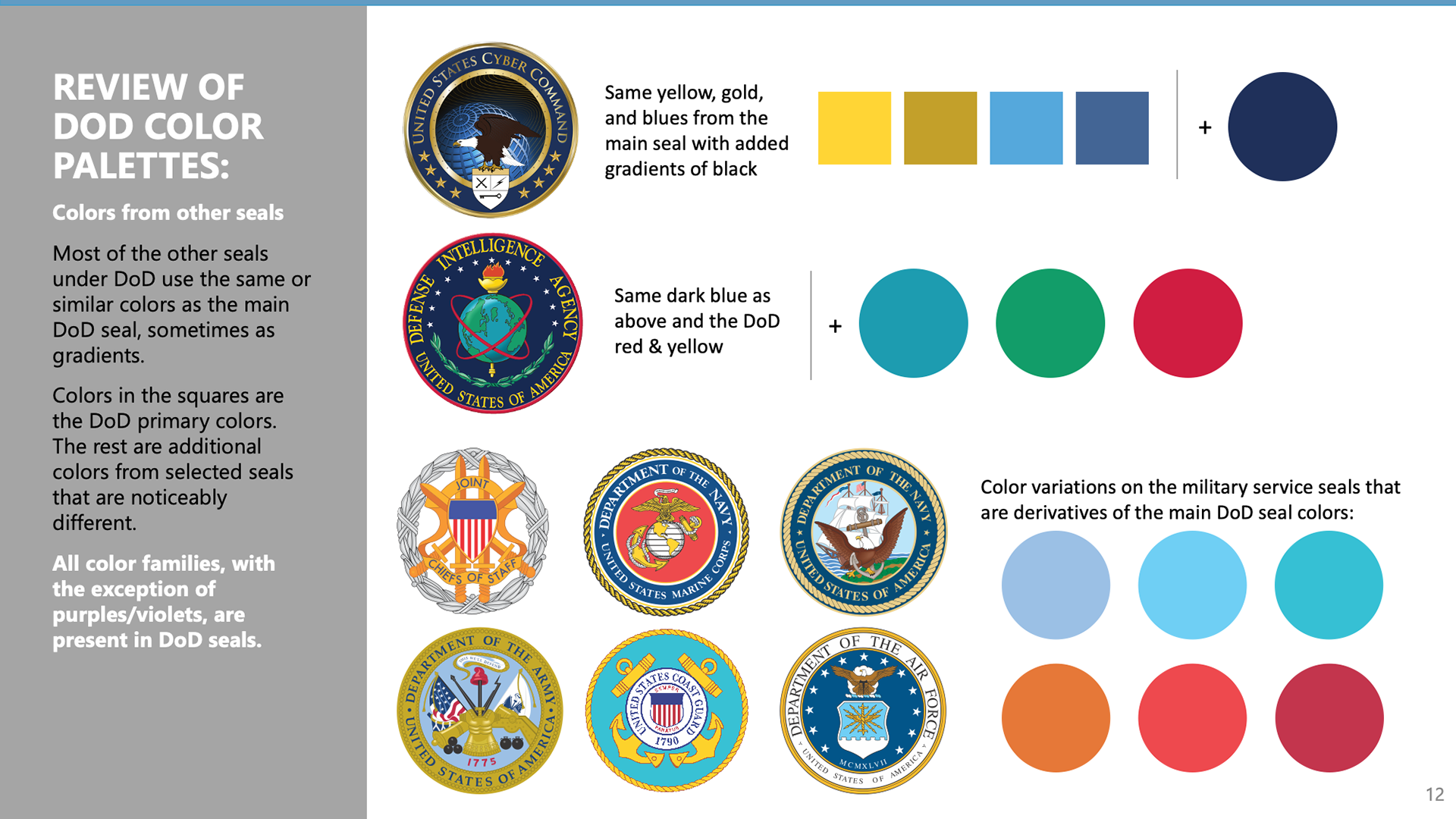
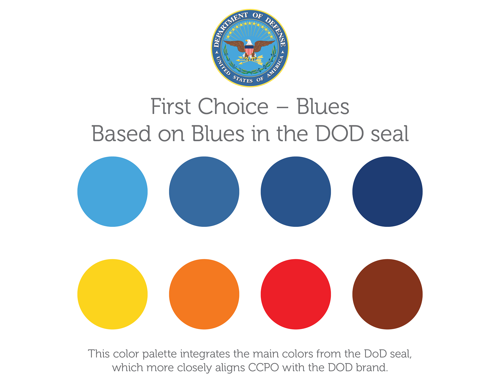
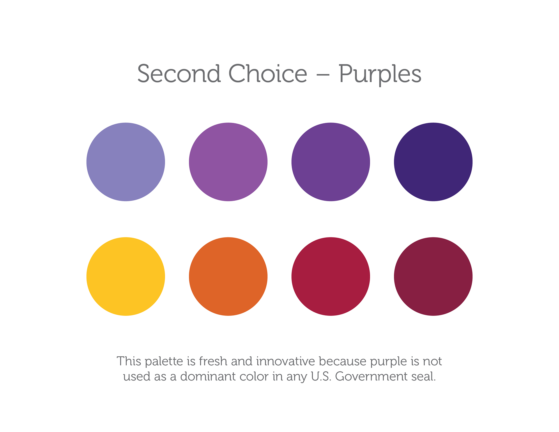
The next step was to look at the psychology of colors and study color palettes of various seals of DOD and other U.S. agencies (civilian and military), followed by a vote by our Pentagon team and stakeholders for the colors best suited the initiative:
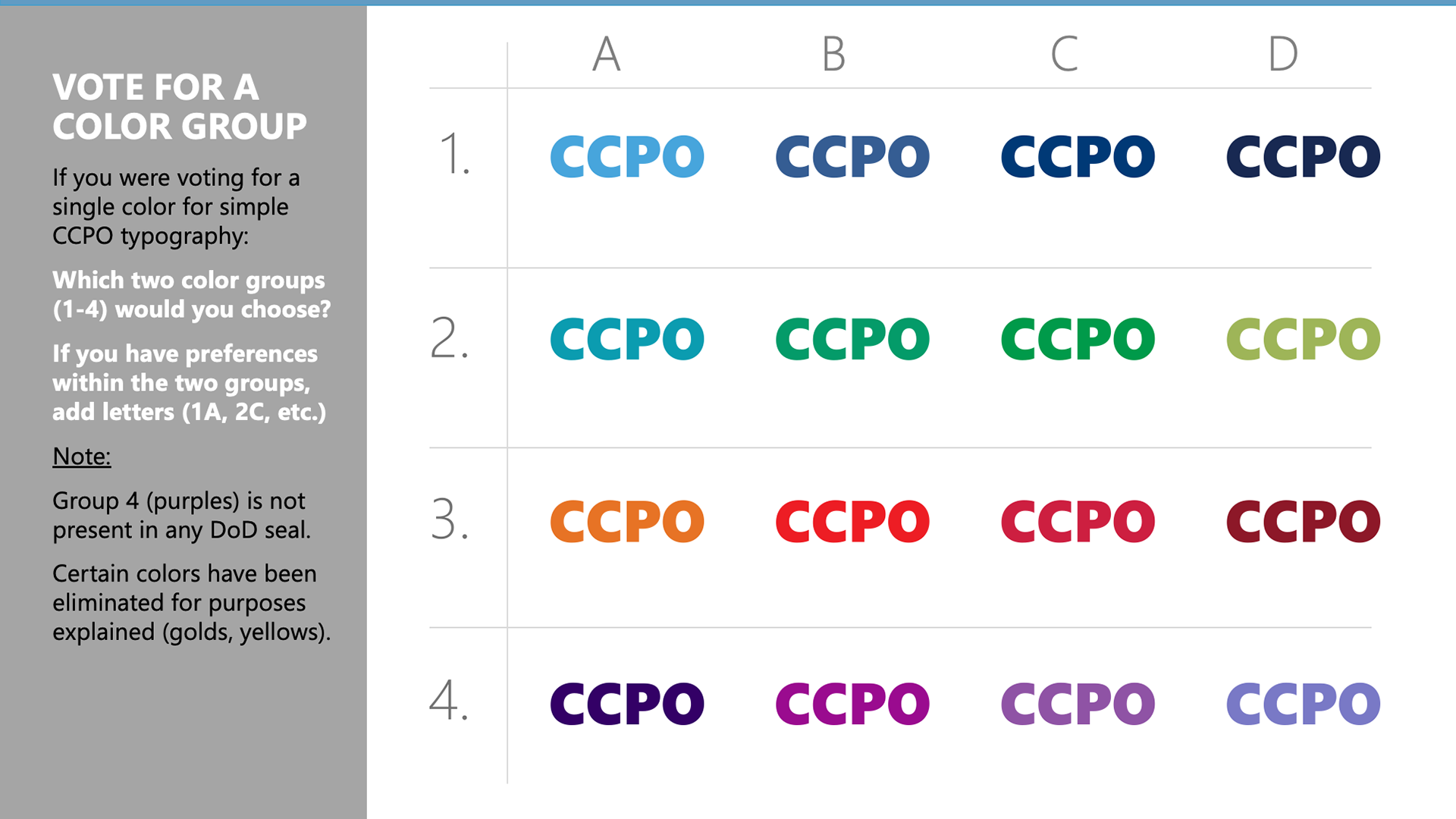
The following result of our client team's live votes during the brand workshop were later used for the CCPO color palette options:

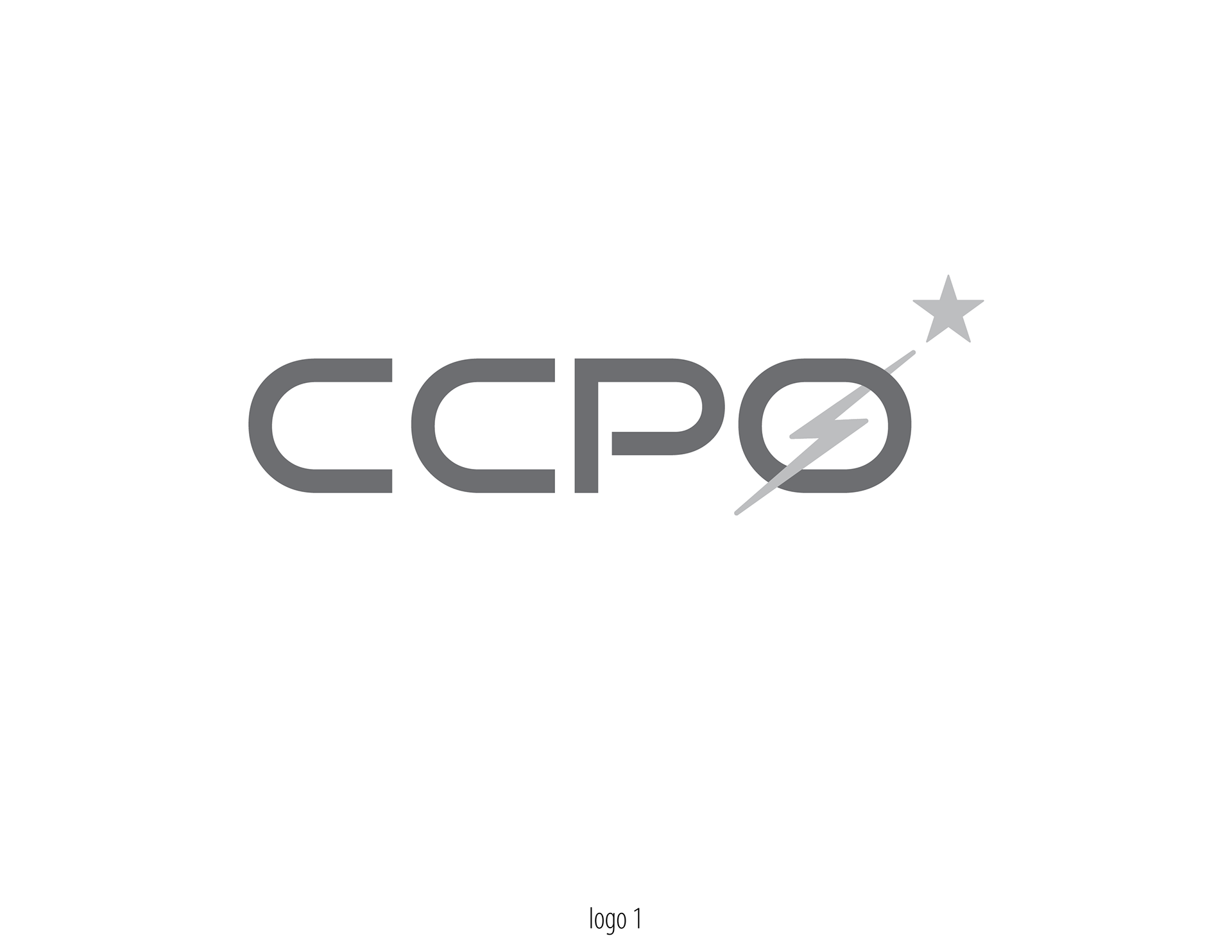
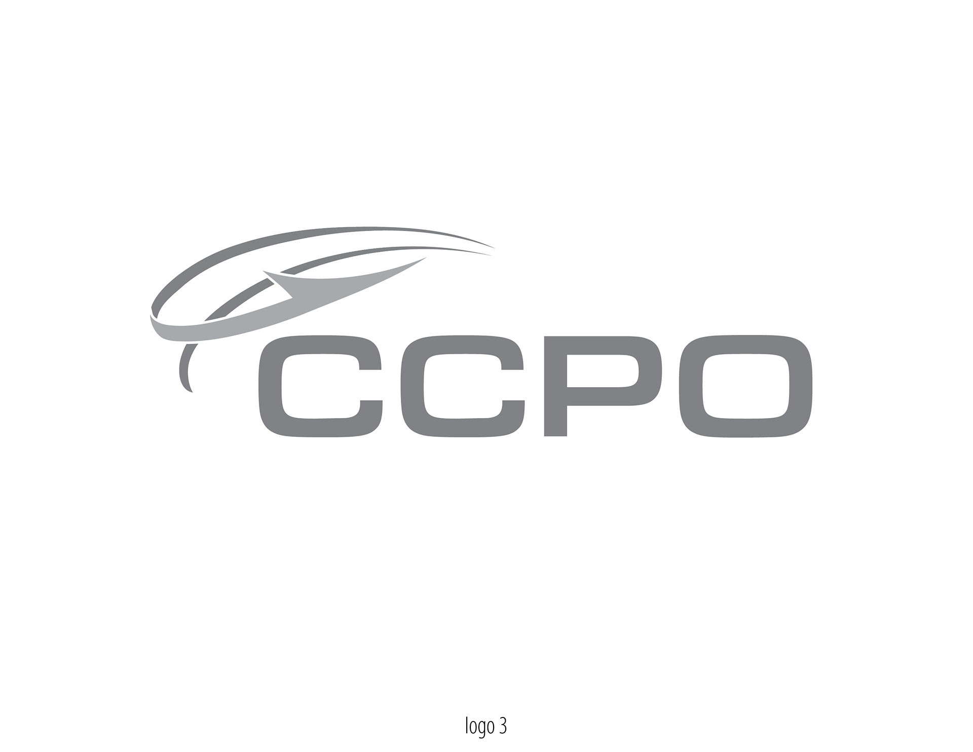
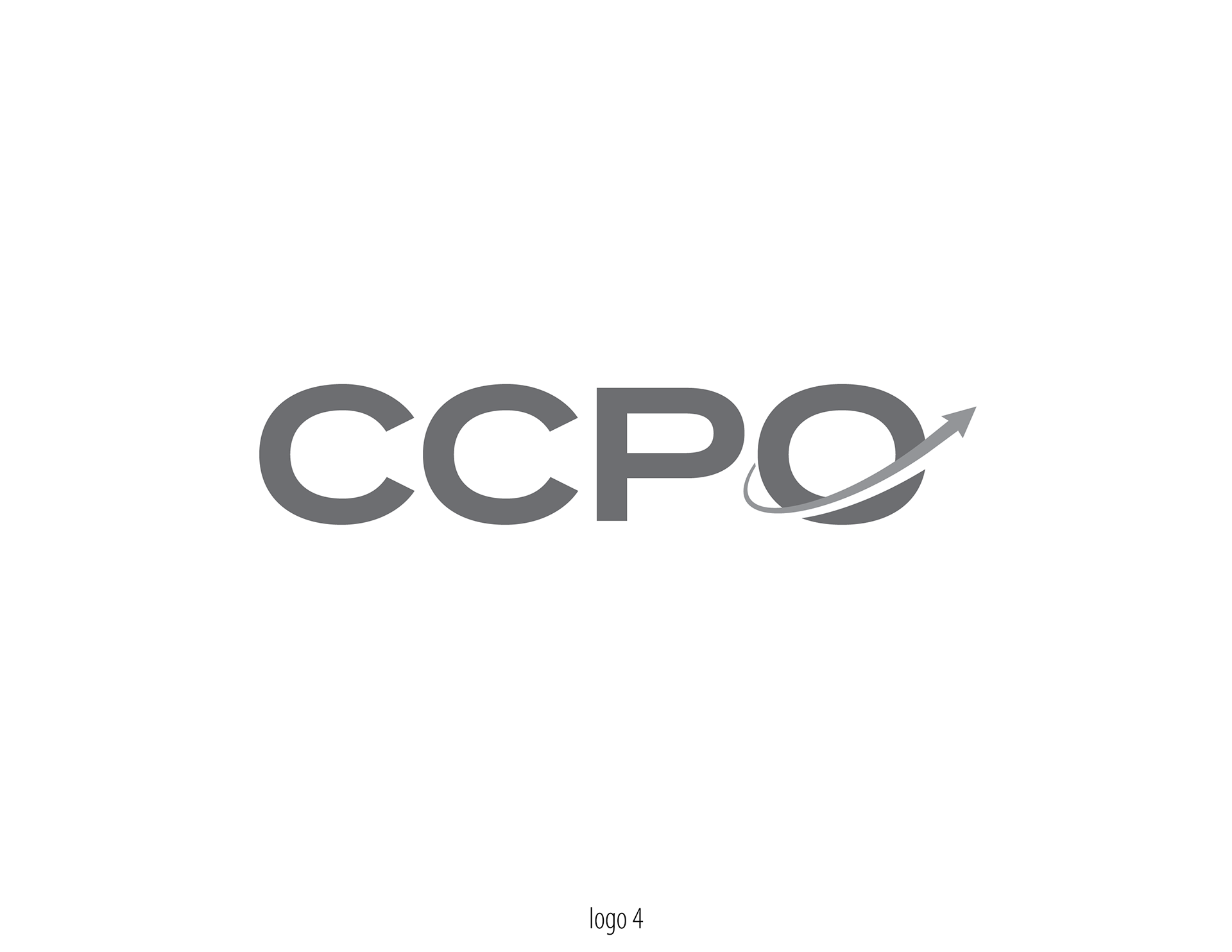
After the brand workshop, I was ready to start the first design options for the seals with a relevant logo version for each seal. To help us all with focusing on composition first, I kept the color applications for later. The logo and seal options I created portray the elements that are aligned with CCPO's identity:


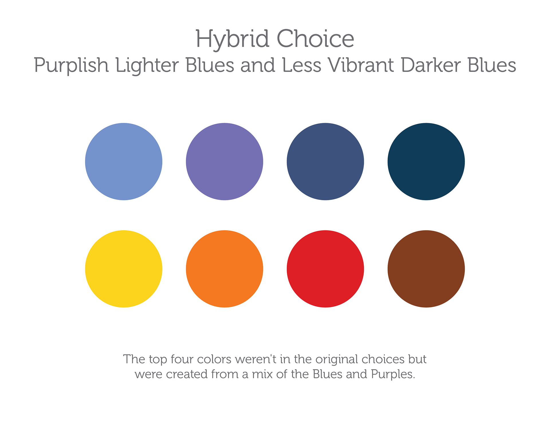
The Pentagon team voted for Seal 4 and decided to unveil only the seal at this stage as the CCPO brand identity and perhaps, reserve the logo version for after being fully recognized by public. Now, my job was to explore the colors on this choice and present the seal with first and second color choices voted during the workshop, as well as a hybrid mix of these two color choices. I also added a light, a medium, and a dark option to each color set, creating a total of nine options to further choose from:


And the winner was no.8

See under cloud.mil/CVR/